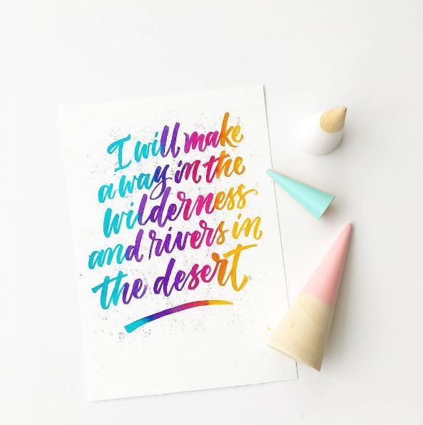
As well as featuring lots of lovely illustrations in each edition of Flow, we also include hand-lettered works by artists from around the world as we’re big fans of typography. We recently came across Typostrate, a website about typography and design, that explores the wonderful world of calligraphy, hand-lettering, graphic design, signage, and much more to do with the written word. Here, we chat with Typostrate’s Christian Goldemann.
Can you tell us a little about Typostrate? What kind of blog are you?
As the name Typostrate is an amalgamation of the words ‘typography’ and ‘illustrate’, we blog about contemporary typography art as opposed to how well typefaces function within columns and rows, or how beautiful Helvetica and Sans Serifs are compared to Didot or Bodoni. We want to show that typography is no longer a subgenre of graphic design; it’s in a league of its own now, with amazing styles and letters. All the artists we feature have a certain personality that is expressed in their artworks.
How did you start Typostrate?
In 2011, I began to notice typography coming to the fore more in its own right, and I started to collect examples purely for myself as inspiration. I kept it all on tumblr as it was the best platform for this kind of ‘diary’. When tumblr asked me to be part of their typography category, Typostrate quickly gained a large following, some of whom started sending in their amazing works. As a result, we created a proper dedicated website. We also set up Facebook, Instagram and Pinterest accounts, but we have still stayed true to our origins, the tumblr blog. We put a lot of time and effort in providing our audience with the latest and best typography art there is, but it’s really rewarding. When you dive into this whole new world of letters and glyphs, you come across so many different styles and artworks—there’s more than enough out there for a whole lifetime of enjoyment!
Which trends in typography do you like?
There are lot of trends at the moment, but there are two that I currently find very interesting. The first is the lettering coming out of Indonesia, where there’s a great pool of talent. And the second is Calligraffiti. Originally an Australian trend that is now popping up in Russia and other Europe countries, this art form is found on walls and combines calligraphy, typography and graffiti.
What’s next in the world of typography?
The next step has to be three-dimensional typography, which would require the use of 3D glasses. Artists could save their works at a certain spot, where others could look at it. Another possible trend could be electric typography, with drawn energy guiding color on the wall.
Christian Goldemann from Typostrate


